Arthur Rothstein
1968
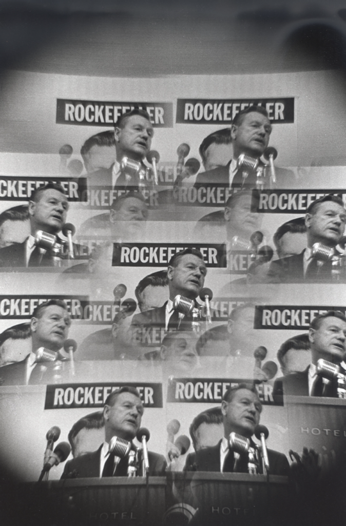
The edit of this picture is what really stood out to me. The middle picture is the clearest, putting the emphasis on that one, while the rest of the pictures are blurry an have a black edge in the corners. The overlapping with makes your eye shift from one picture to the next. I really like how this was done.

