Eleanor
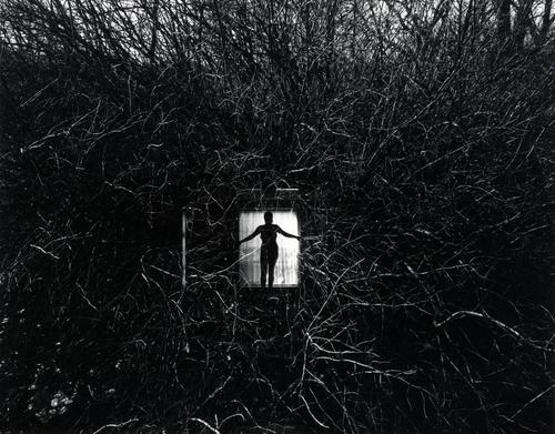
In this image, Harry Callahan had used a black and white filter. Without the colors, you can better see the women better. He strengthen the shadow of the branches and he made them sharper to better enhance the women in the center. Even though the women only takes so little space, but that is where the “only” light of this image come from. And I believe this photo is more like a tableaux, he must have edited it in someway to make the women in the very center with the window and the curtain, maybe showing that she is trapped.
Harry Callahan, Eleanor, 1951, https://www.metmuseum.org/art/collection/search/266590
