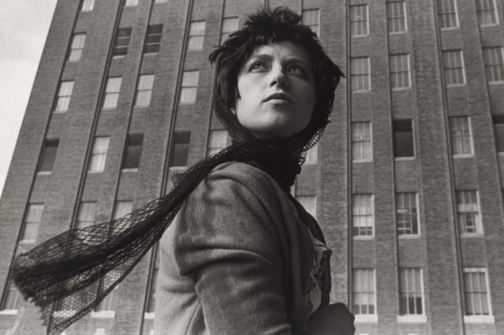
I found this photo rather appealing because of the many photographic aspects that make it so successful as a portrait. First, the composed makes for a strikingly unique image. The women’s scarf occupies the bottom left of the image whereas her body takes up the space in the middle of the image. A faux-sense of space is also create with the positioning of her eyes. They seem to be looking off into the upper left distance. The way her eyes and body are positioned makes us wonder what she’s actually looking at. Again, another compelling part of the photo. In addition, I like how the building in the background has different number of darker windows on one side than the other. This clear unbalance adds character and a further unique look to the image. A contrast is created by the dark scarf she has as well as her darker hair.
Cindy Sherman, United Film still #58, Gelatin Silver Print, 1950s-60s (Hollywood)

