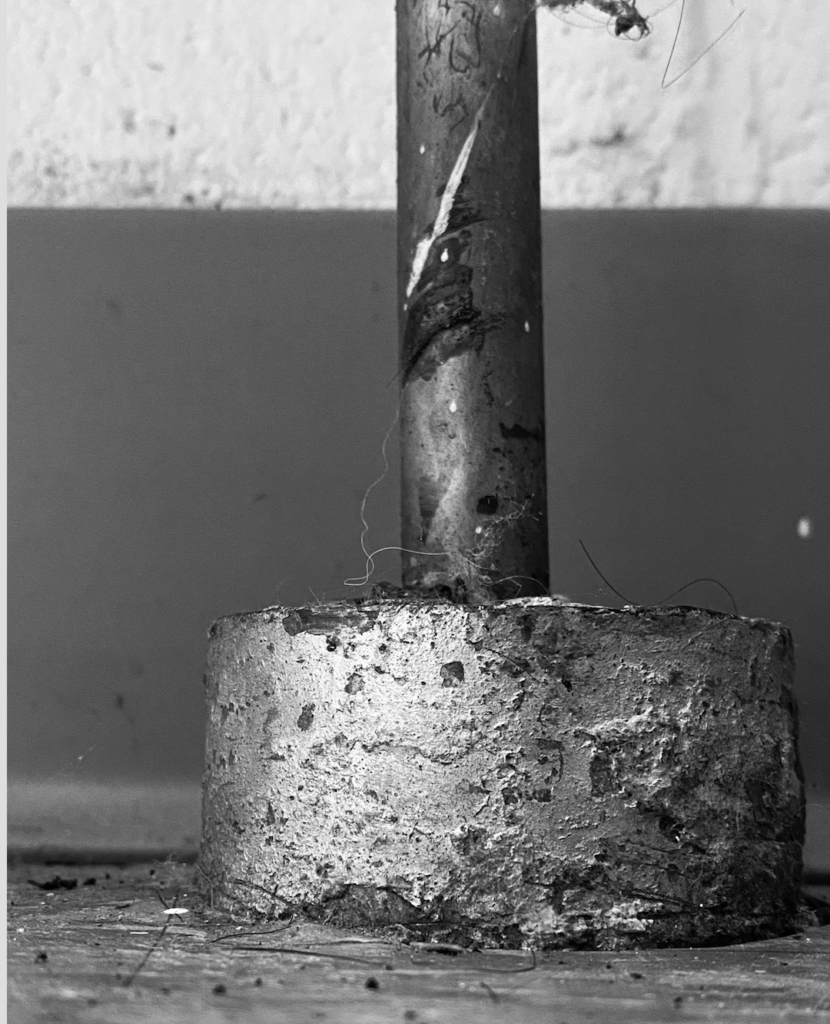
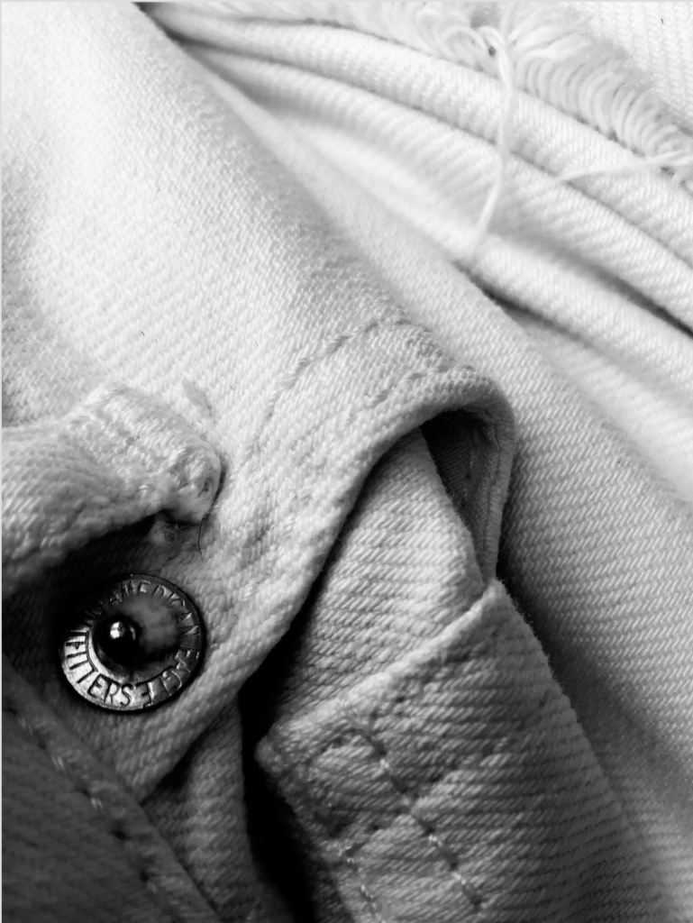
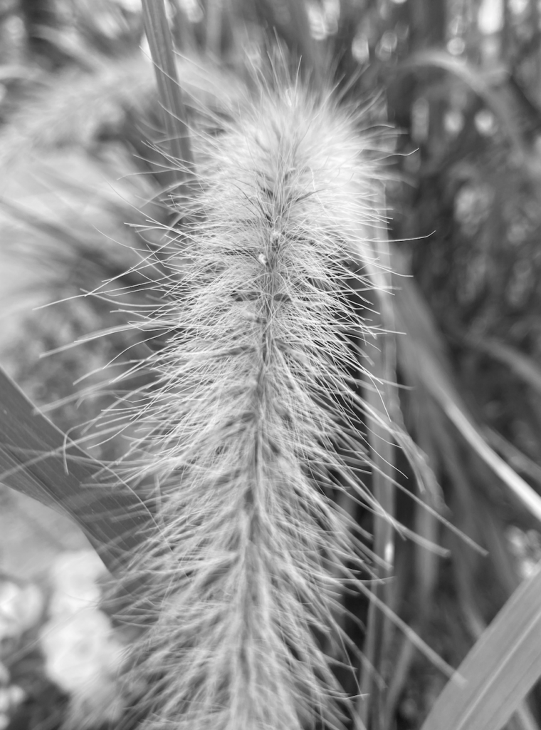
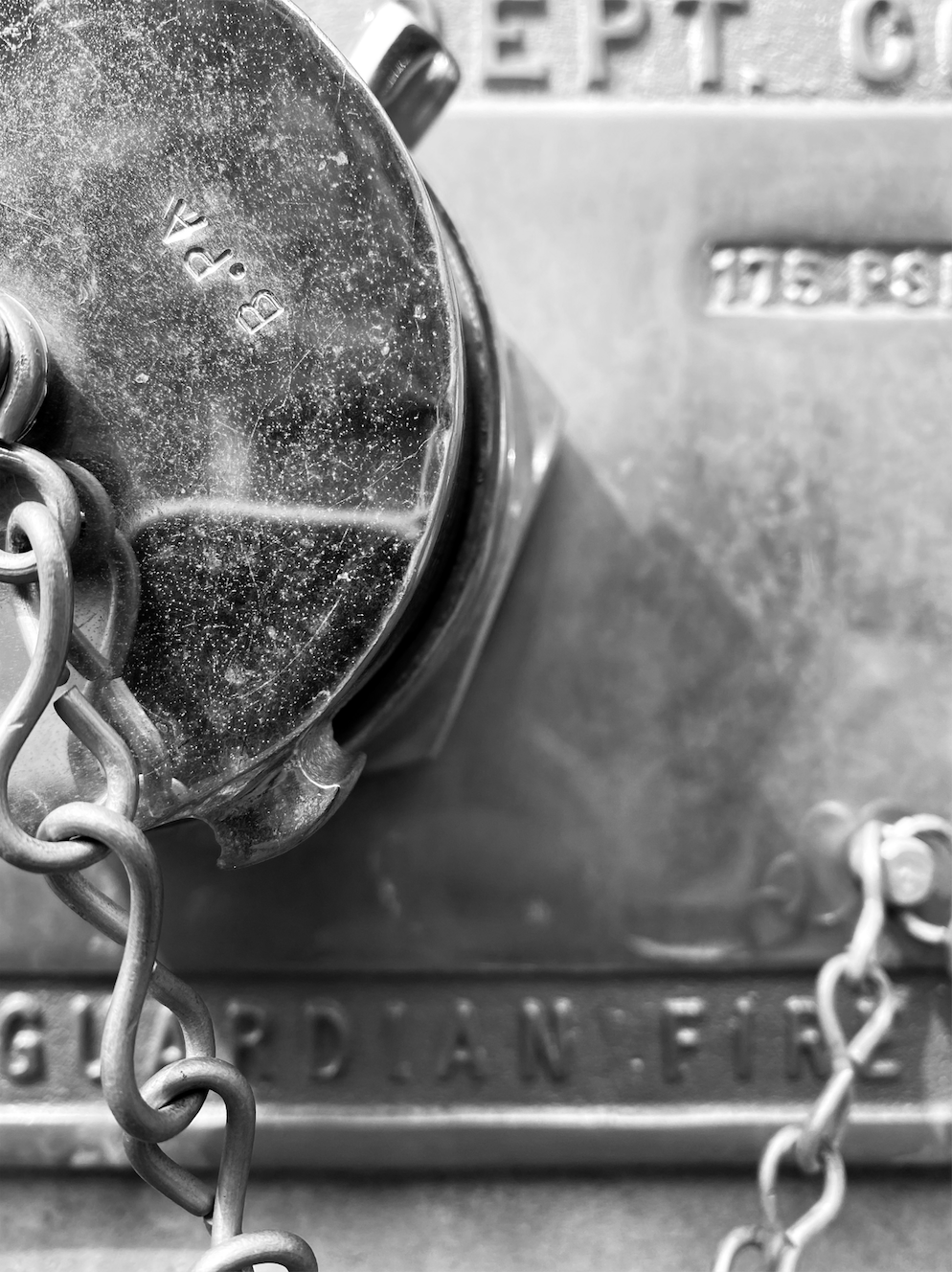
These 4 photos were the ones that I think best show texture.

Rusted Pole 
Jean Shorts 
Flower 
Fire Hydrant
I chose these 4 texture images because I think each one has a unique way of presenting different textures. From intricate fabric to aged rust, these photos give a range of visual texture along with carefully thought out composition of the photos. I tried to take photos that were abstract so that viewers are able to focus on the key textured areas. For example, the fire hydrant, pole in the ground, and jean shorts are all following a rule of thirds composition where the main focus of the photo is not placed right in the middle but rather the corners of the images.
Eva


I think the fire hydrant photo would look really interesting as a large print. I picture it on a large canvas that matches with a room of the same neutrals. I also think it could look nice as a smaller series with the rusted pole image. The jeans image is great, but could be tricky to decide which would look better; a larger or smaller piece.
All of Eva’s photographs are so beautiful pictures and I am truly impressed with all of them. I personally think none of these photos should be printed as a large print. Because these pictures are simple and focused on only one small subject, I think that all of these would look better if printed as a mini print. The picture of the Jean Shorts is so interesting with the folds of the fabric and the buttons. The Flower is such a pretty picture. I love how you can see all of the pieces fraying everywhere. I can imagine how the flower would feel and that helps me resonate better with an image. The fact that Eva put all of these pictures in black and white makes them all complement each other so well. Especially, the Rusted Pole and Fire Hydrant, they really complement each other really well and could be a series printed together.