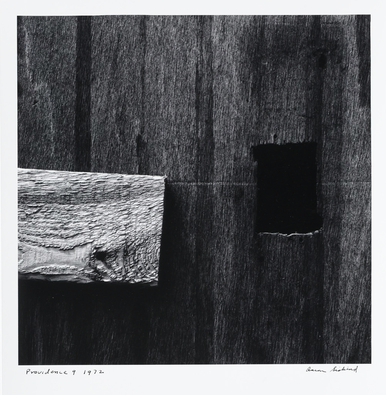
In this photograph, Aaron Siskind uses real life objects to create what looks to be a more abstract image. The piece of wood closest to the viewer lays against a darker, much larger piece of wood. The black and white filter really emphasizes a distinction between the light and dark wash of both materials. Within the background, on the darker plank of wood, there is also a square opening. This opening is the darkest spot in the image, which is intensified by the black and white filter; creating a deeper contrast against the lighter pieces of wood and drawing the viewers’ attention to the hole. Another technique Siskind uses is the crossing of horizontal and vertical lines. The lighter wash wood intersects the vertical background with an aggressive horizontal. And although the deep black square moves with the vertical background, the small hole crosses directly over a prominent horizontal line. Siskind also structures this image so a lot of the objects seem to bleed off the page which makes the image seem large. The viewer is unable to see the pieces of wood in their entirety as Siskind photographed them in this specific way; cutting off some of the edges.


As far as I know, all of Siskind’s abstractions were black and white film photography. There was no filter involved to change color to black and white as it is frequently done today with digital photography. You have accurately noted how Siskind crops his closeups and made good observations about light and dark elements.