Analysis of Aaron Siskinds photo, Chicago (22)

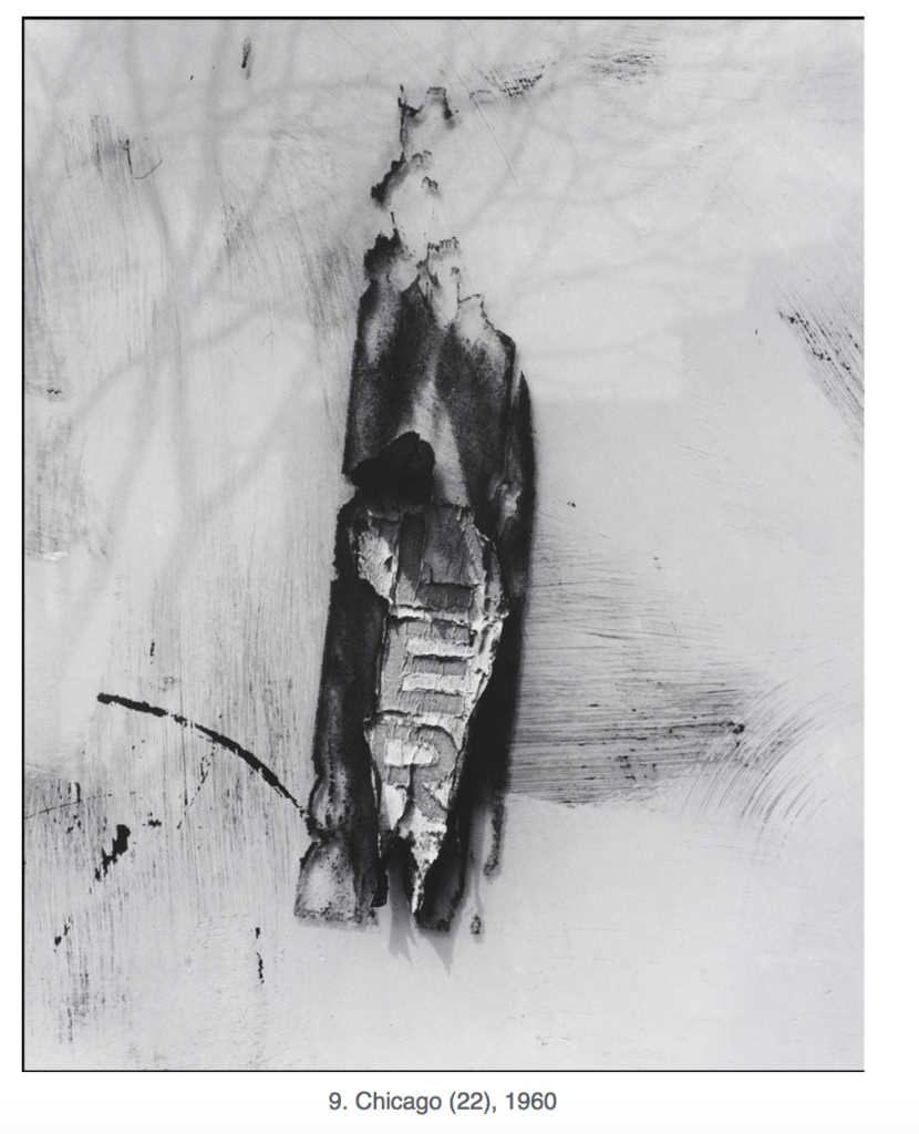
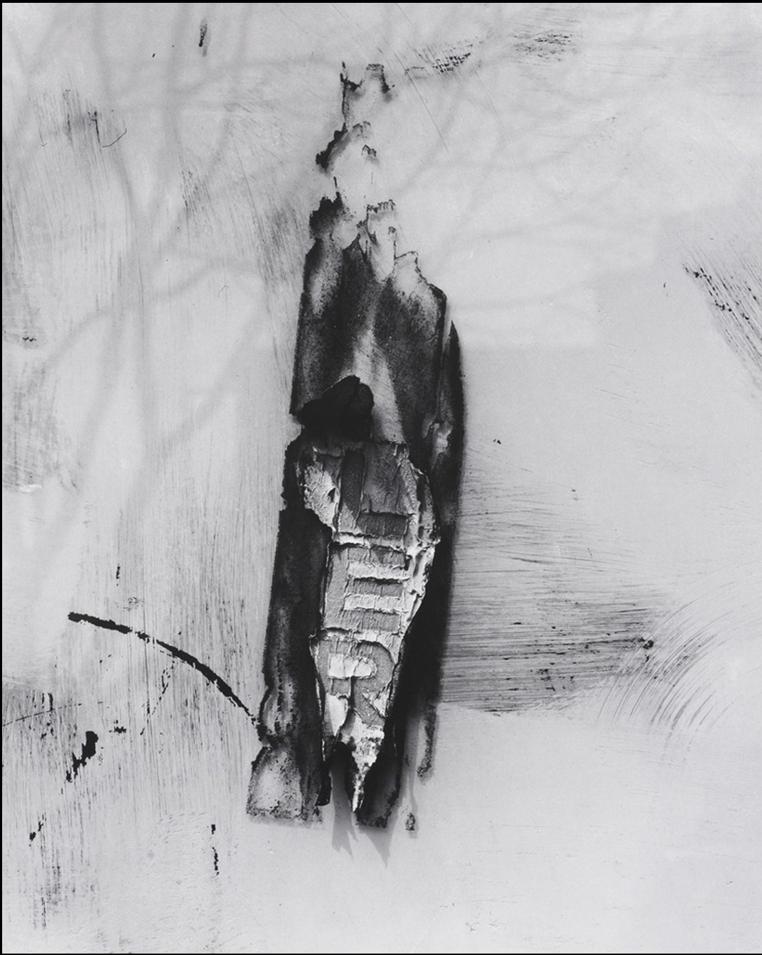
The following photo was shot by Aaron Siskind in Chicago, 1960. This photo shows a wall or sign that seems to have part of the main lettering peeling off of it. Choosing to put this photograph in black & white forces viewers to focus on the shapes, textures, and forms that are presented within it, rather than the original colors. This abstract photograph clearly shows a strong contrast with the dark blacks and very light whites that were incorporated in the process of creating the image. In addition to these, we also see a variety of grey tones scattered throughout the photograph. The inclusion of these vertical and horizontal grey streaks give us a clear idea of the aging that has a occurred around the subject of the image. Siskind successfully framed this picture to have the three peeling letters in the middle of the wall as the main focal point. The image is cropped in a way that places these three letters (LER) are placed in a horizontal alignment right in the middle of the image, therefore emphasizing them. The success of this focal point comes from both the placement as well as the contrast that is created by the dark peeling wall that frames the letters in the center. The image also includes subtle shadows in the top left corner that seem to be caused by a tangled structure (perhaps a tree) in order to balance out the images strong contrast.
Eva Bartell


Good observation of texture on the letters and tree shadow.