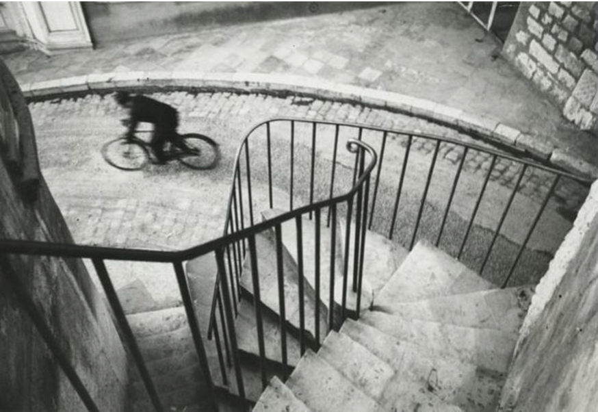
Photo Taken by Henri Cartier-Bresson

This image posses many unique components that contribute to its successful. The main ones that I noticed are composition, contrast, and movement. The main subject seems a little more blurred than the rest of the image. The staircase and road all seem to be very stagnant and in focus while the man on the bike is blurred. This blur affect adds a good sense of movement within the image. The Biker draws attention to the top left of the image while the vertical and horizontal lines created by the staircases railing created a diagonal line from the top right corner to the bottom left. This composition forces people to focus on the abstract lines created within the image. The contrast of lights to darks also adds to the abstract focus. By having this image be in black and white, the photographer chose to have the main focus of the image be the shapes and composition rather than the colors given of by the original image. This image captured my attention because of the unique “looking down” affect that was created by shooting this image from above the main subject. This image is relevant to digital artists now because shows our current photographer the importance of b&w images.
Cartier-Bresson, Heeres, France, 1932, Gelatin Silver Print 6 × 9 in15.2 × 22.9 cm
