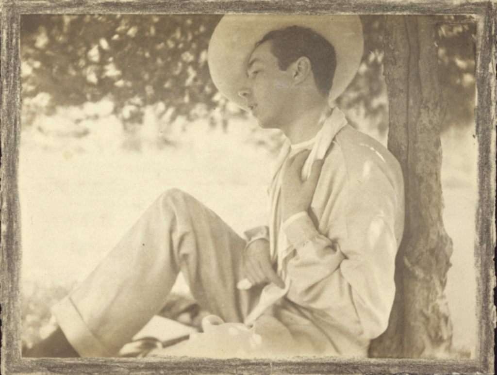
Shot by Gertrude Kaesbier in Newport Rhode Island (1903)

I found Gertrude Kaesbiers portrait of Baron de Meyer particularly compelling due to the exceptional crafting of the image. This photograph truly reveals much more than a formal portrait often would. Baron de Meyers personality is clearly enraptured through the he way he was photographed by Kaesbiers. Different intimacies throughout the photograph are the simple explanation for why this image is so successful. For example, the way his body is leaned back against a perfectly vertical tree makes for a well balanced portrait. The top right corner of the image mostly consists of Meyers side profile along with a tilted rimmed hat, while the bottom left of the image is balanced with his diagonally lined knee. Not only is this image balanced well with he composition but it is also balanced by its contrast of lights and darks. The dark components include the branches/stump of the tree, his hair, and his socks. While the light components include the far background as well as his clothing and skin. Lighter grey tines can be found in the intricate wrinkles of his white clothing.
Gertrude Kaesbiers, Portrait of Baron de Meyer at Newport, Rhode Island, (American, 1852 – 1934) http://www.getty.edu/art/collection/objects/36901/gertrude-kasebier-portrait-of-baron-de-meyer-at-newport-rhode-island-american-1903/
Eva

Good observation of balanced use of lights and darks and compositional lines.