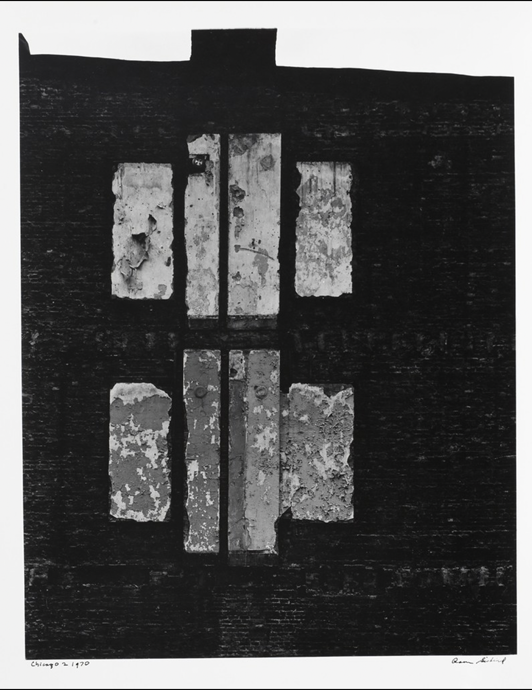
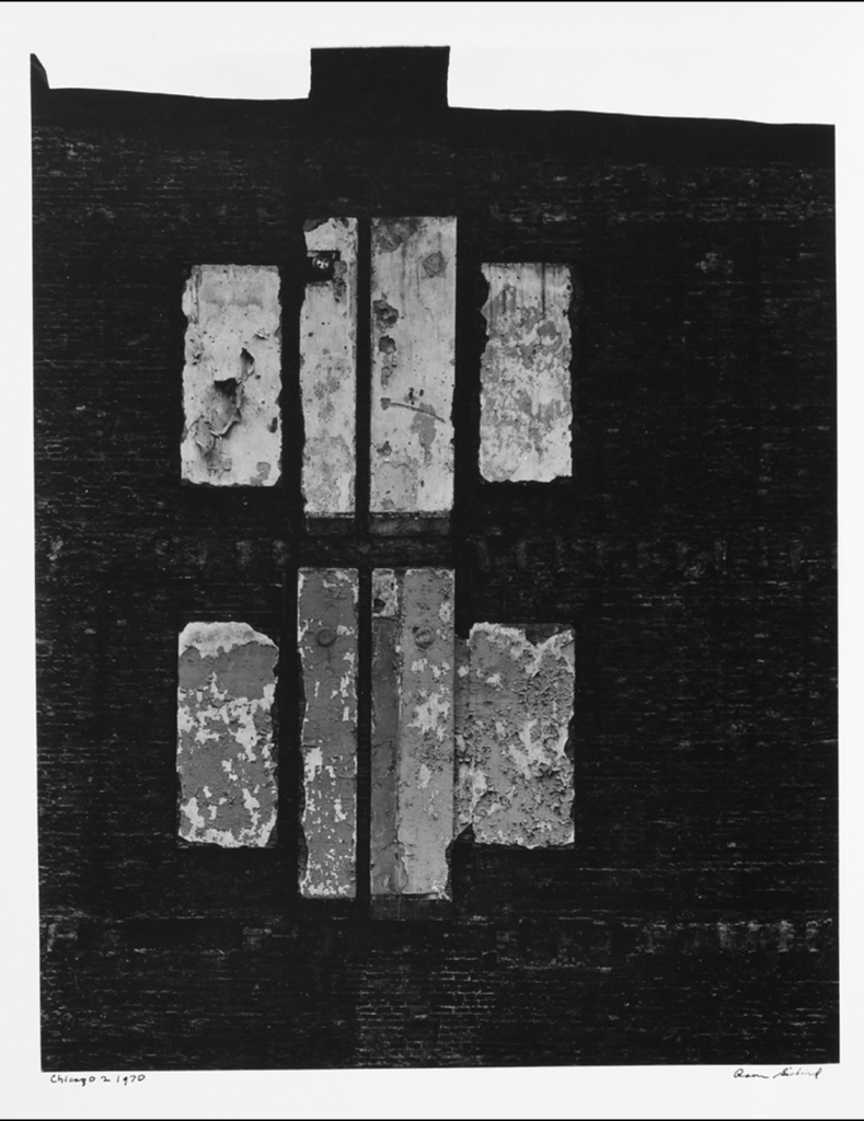
This image is entitled Chicago 2 and was taken in Chicago, Illinois in 1970. The monochrome coloring in this photo allows the lighter shades of white and gray to seem more vibrant and accented against the darker black tones of the wall that encompass the majority of the photo, thus creating the more abstract style. This photo shows deep and varied textures which are further accented by the contrast and variance of color and tone in the photo. I also noticed that a feature clearly depicted in the photo is symmetry. I think that Siskind was trying to capture the symmetry of the two more bold symbols in this photo as a way to create a more distinct and layered image. The monochrome allows the texture and tone of the photo to stand out more whereas if it were a colored photograph, these clear variances would not be as evident or effectively shown.


Also describe the central shapes, how many shapes and their relative sizes. Are the shapes grouped in any way?