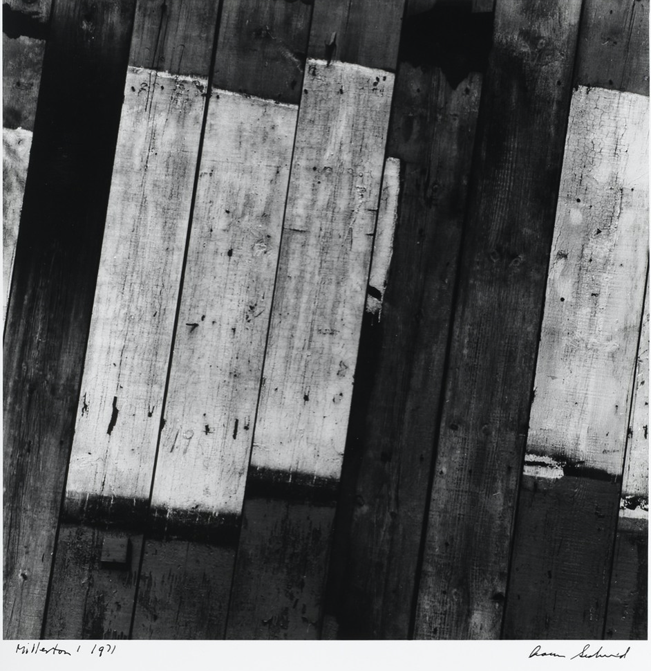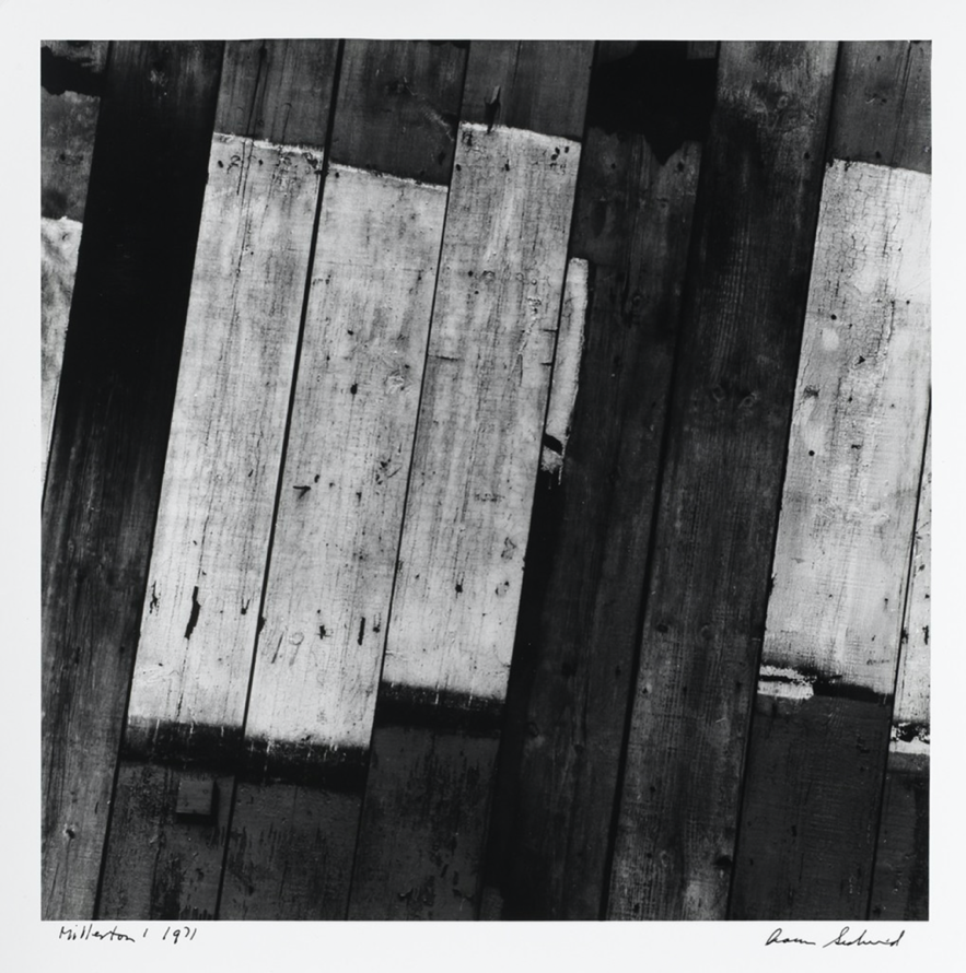
Aaron Siskind’s photo of wood paneling, “Millerton 1” was taken in 1971. It is a black and white photo that illustrates the distinction between light and dark colors. Half of the strips have been power washed giving them a bleached finish and creating an immediate contrast in the photo. The knots seen in the lighter wood paneling give the photo texture and the lack of symmetry in the paneling gives the photo an authentically rustic look.


You can also talk about line direction and diagonals. How do diagonal lines compare with horizontal and vertical lines in terms of conveying energy?